반응형
React Native Header - Functional Component Hooks
React Native 앱 개발 중에 본인이 원하는 custom header bar 가 필요한 경우가 있습니다.
그럴 경우에 사용할 custom header bar를 만들어 보겠습니다.
React Navigation을 사용하면 자동으로 header bar가 생성되게 됩니다.
우선 기본으로 제공해주는 header bar를 먼저 제거해줍니다.
방법을 모르시는 분은 아래 링크를 참조해주세요.
[React Native] Navigation Option no Header 헤더 없애기, 제거
React Native Navigation Option no HeaderBar 헤더 없애기, 제거 React Native 앱 개발을 하시다가 상단의 HeaderBar를 제거하는 방법을 알려드리겠습니다. 실행환경은 MacBook Pro M1 이며, Visual Studio Code..
dlee0129.tistory.com
이제 HeaderBar component를 만들겠습니다.
Header.js
import React from 'react';
import { View, StyleSheet, Text, TouchableOpacity } from 'react-native';
import { height } from '../../config/globalStyles';

const AppHeader = ({
    title,
    titlePress,
    noIcon,
    rightIcon,
    rightIconPress,
    leftIcon,
    leftIconPress,
}) => {

    return (
        <View style={styles.container}>
            {leftIcon &&
                <TouchableOpacity
                    style={styles.leftIcon}
                    onPress={leftIconPress}
                >
                    {leftIcon}
                </TouchableOpacity>

            }
            <View style={[styles.titleContainer, noIcon ? {} : { alignSelf: 'center' }]}>
                <TouchableOpacity
                    onPress={titlePress}
                    disabled={titlePress ? false : true}
                >
                    <Text style={{ textAlign: 'center' }}> {title} </Text>
                </TouchableOpacity>
            </View>
            {rightIcon &&
                <TouchableOpacity
                    style={styles.rightIcon}
                    onPress={rightIconPress}
                >
                    {rightIcon}
                </TouchableOpacity>
            }
        </View>
    )
}

const styles = StyleSheet.create({
    container: {
        height: height * 32,
        marginTop: height * 32,
    },
    titleContainer: {
        height: '100%',
        justifyContent: 'center',
    },
    leftIcon: {
        position: 'absolute',
        top: 10,
        left: 5,
        justifyContent: 'center'
    },
    rightIcon: {
        position: 'absolute',
        bottom: 10,
        right: 5,
        justifyContent: 'center'
    }
})

export default AppHeader;
저는 왼쪽 오른쪽 아이콘을 필요에 따라 입력 받아 사용하는 코드로 작성하였습니다.
유연하게 상황에 맞춰서 아이콘과 touch event를 주어 동작하게 해주면 됩니다.
Apptext와 globalStyle 때문에 그대로 복사하시면 오류가 나게 됩니다.
Apptext는 기본 Text로 height는 없이 사용하시면 정상 작동하게 됩니다.
사용 예시입니다.
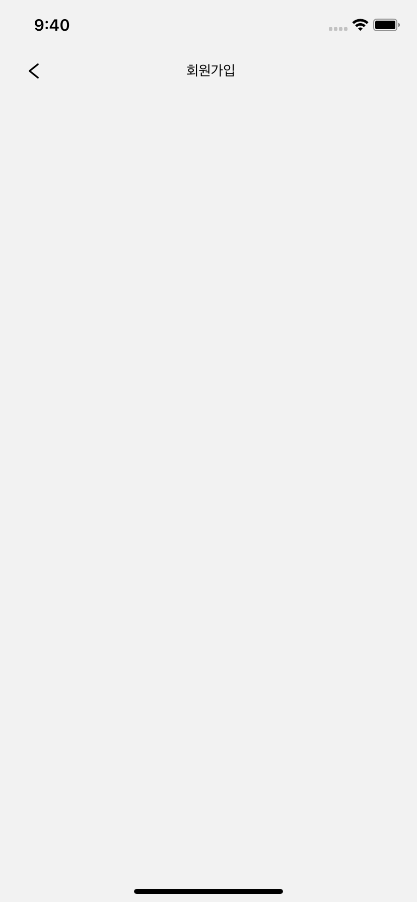
Login.js
import React from 'react';
import { View, StyleSheet, Text } from 'react-native';
import { screenStyle } from '../config/globalStyles';
import AppHeader from '../components/Header/AppHeader'
import Icon from 'react-native-vector-icons/AntDesign';

const Login = ({ navigation }) => {

    return (
        <View style={screenStyle}>
            <AppHeader
                title="회원가입"
                noIcon={false}
                leftIcon={<Icon name="left" size={20} />}
                leftIconPress={() => navigation.goBack()}
            />
        </View>
    )
}

export default Login;
반응형
'웹, 앱 개발 > RN React-Native' 카테고리의 다른 글
| [React Native] Stopwatch - Functional Component Hooks (0) | 2021.01.25 |
|---|---|
| [React Native] react-native-stopwatch-timer (0) | 2021.01.25 |
| [React Native] Modal - Functional Component Hooks (0) | 2021.01.24 |
| [React Native] Text - Functional Component Hooks (0) | 2021.01.23 |
| [React Native] Navigation Option no Header 헤더 없애기, 제거 (0) | 2021.01.23 |